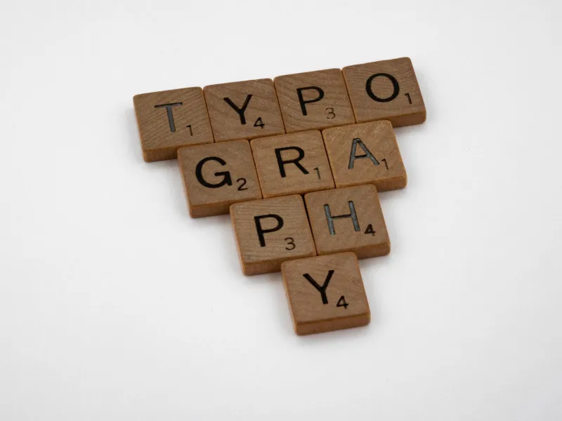
Rules That Revenue: How Design Constraints Beat Creative Chaos

There's a persistent myth in the creative world that freedom is the mother of great design. Give your team a blank canvas, zero guardrails, and infinite options — and genius will emerge. It's a romantic idea. It's also, in most real-world business contexts, completely wrong.
The brands that consistently outperform on recognition, trust, and conversion aren't the ones with the loosest briefs. They're the ones with the tightest systems. And the data, when you actually look at it, is pretty hard to argue with.
The Paradox of Too Many Options
Decision fatigue is real — and it doesn't just affect consumers. It hits designers, too. When a team has unlimited typefaces, unlimited color combinations, and no structural grid to anchor their layouts, every project becomes a negotiation with infinite possibility. That sounds exciting until you're three rounds of revisions deep and nobody can agree on whether the CTA button should be teal or cobalt.
Constraint-based design sidesteps that entirely. When the grid is fixed, when the type scale is defined, when the spacing rules are non-negotiable — decisions get made faster, output gets more consistent, and the brand starts to actually look like itself across every touchpoint.
Spotify is a textbook case. Their internal design system, Encore, locked down everything from component spacing to icon weights. Before Encore, their app, marketing pages, and desktop client felt like they were made by three different companies. After? The brand cohesion was immediate — and so was the improvement in user engagement metrics. Fewer visual surprises meant users spent less cognitive energy orienting themselves and more time actually using the product.
Grids Aren't a Cage — They're a Launchpad
Here's the reframe that changes everything: a rigid grid doesn't limit creativity. It redirects it. When a designer isn't burning mental energy deciding where elements could go, they focus on what those elements say and how they feel. The craft moves up the value chain.
Think about how editorial publications operate. The New York Times has run on essentially the same column grid for decades. That constraint isn't laziness — it's brand equity. Readers don't have to relearn how to read the page every time they open it. The familiarity is the experience.
For tech and lifestyle brands especially, that kind of visual predictability translates directly to trust. And trust, in a crowded digital market, is a conversion engine.
What the Numbers Actually Say
Linear, a project management tool that's become something of a cult favorite among engineering teams, built their entire product and marketing presence around an almost ruthlessly minimal design system. Fixed spacing increments. A narrow type palette. A grid that leaves almost no room for improvisation. The result? A product that feels impossibly polished — and a brand that punches way above its weight in a market dominated by bloated, feature-heavy competitors.
Linear's design discipline isn't just aesthetic preference. It's a business strategy. In SaaS, where the first impression is almost always the landing page, visual coherence signals product quality. If your marketing looks scattered, the assumption is your product is too.
Stripe is another example worth studying. Their design system is so well-regarded that other companies have reverse-engineered it just to understand the principles. The consistent use of a baseline grid, a controlled type hierarchy, and deliberate whitespace didn't happen by accident — it was the result of intentional constraint. And Stripe's brand trust, in a category where trust is literally the product, is arguably one of their most valuable assets.
The Conversion Connection
Let's get specific about why this matters to your bottom line.
When a brand's visual language is inconsistent — different button styles across pages, mismatched heading scales, arbitrary spacing decisions — users register that inconsistency even if they can't name it. It creates a low-level friction that chips away at confidence. In e-commerce, that friction shows up in cart abandonment. In SaaS, it shows up in trial-to-paid conversion rates. In service businesses, it shows up in inquiry drop-off.
A study from McKinsey found that companies with strong design practices outperformed industry benchmarks by up to 32% in revenue growth. That's not because those companies had more creative designers. It's because they had systems — structures that made every customer-facing output feel intentional and cohesive.
Constraint is what creates that coherence. And coherence is what converts.
Building Constraints That Actually Work
So what does a healthy constraint-based design system actually look like in practice? A few principles worth keeping front of mind:
Start with the grid, not the content. Before you design anything, decide how your layouts are structured. An 8-point grid is a solid starting place for most digital products — it creates natural harmony across spacing, sizing, and alignment without being so rigid that it breaks on edge cases.
Limit your type scale. You don't need twelve heading sizes. You need four, maybe five, with clear hierarchy rules. Every size should earn its place.
Define your components before you design your pages. Buttons, cards, form fields, navigation — lock these down first. Page-level design becomes significantly faster and more consistent when you're assembling from a defined kit rather than inventing from scratch.
Treat the design system as a living document, not a locked PDF. Constraints should evolve as your brand evolves — but they should evolve deliberately, not drift accidentally.
The Plane White Principle
At Plane White Designs, we've built our entire philosophy around this idea. The name itself is the point — white space, clean structure, zero noise. Not because we're afraid of creativity, but because we've seen what happens when creativity operates without structure. You get beautiful chaos that doesn't convert. You get brands that look interesting in a portfolio and confusing in the wild.
The brands we most admire — and the ones we try to build — are the ones where every decision feels inevitable. Where you couldn't imagine the logo being a different weight, or the grid being a different width. That sense of inevitability isn't luck. It's the product of constraint applied with intention.
Giving your design team unlimited freedom might feel generous. Giving them the right rules might actually be the gift.